So while I’m enjoying my vacation you guys get to read about my oh-so-pretty and oh-sooo-expensive palette which I picked up while in USA. It’s the Too Faced Chocolate Bar Palette ($49 in Sephora online store, not available in Slovenia of course). The shades are made with cocoa powder which makes them smell heavenly. I am not joking either – every time I open up this palette I stand there for a good 10 second just smelling it. Weird? Don’t judge – you would do it as well, take my word for it. I could probably get away with eating this palette – the shadows are formulated without parabens, sulfates phthalates and all that other icky stuff.
 |
|
| You can see it’s being well loved, even though it IS a little bit dirty |
I was really hesitant to spend this much money on a single product but when I swatched the eyeshadows in Sephora I knew this babe was coming home with me. While the packaging leaves me quite cold (I would prefer a sleek palette with better closing patent, not a juvenile chocolate-bar looking packaging), it’s what’s on the inside that counts. I can also mentioned that I dropped this palette twice now from about 1,5m high and there were absolutely no consequences to the shadows or to the packaging, so the quality is obviously there (but I still need to work on being less clumsy).
Let’s get into it – first, some swatches of the two larger shades – the illuminators/highlighters. Mind the names of all the swatches – it’s another palette where they put a lot of thought into coming up with name ideas and I LOVE them.

White chocolate is the top larger shade. This I normally use under my eyebrows (on the browbone). It’s a soft white with a little bit of fallout (especially when using EcoTools brushes, so maybe I need to replace those), but still a nice illuminating shade. This color could also be used all over the lid as a primer for something more intense.
Let’s get into it – first, some swatches of the two larger shades – the illuminators/highlighters. Mind the names of all the swatches – it’s another palette where they put a lot of thought into coming up with name ideas and I LOVE them.
White chocolate is the top larger shade. This I normally use under my eyebrows (on the browbone). It’s a soft white with a little bit of fallout (especially when using EcoTools brushes, so maybe I need to replace those), but still a nice illuminating shade. This color could also be used all over the lid as a primer for something more intense.
The right one with the quite poor swatch (Champagne Truffle) is the bottom larger shade. This I use in the tearduct but I also used it as a cheek ilumminator and it worked just as well. It’s not too crazily pigmented which is probably why it works so well in any circumstance.
| Upper row (without the white chocolate) |
These four colors look very different in the palette and they deliver on that promise when it comes to the application. The Gilded Ganache is a very nice shimmery greenish color which is complemented with another shimmer in this row, the violet (purple) Black Forrest Truffle. These both are super pigmented – I literally just have to touch the brush gently to the palette to get enough product for the entire look.
Next to them, we have two matte colors – the Milk chocolate (which is my absolute favorite for the crease color) and the Tripple fudge. I must say that the latter is a bit disappointing in terms of pigmentation – I was hoping for a really strong, bold black which would be useful for the cat-eye look, but it somewhat falls short on that. Still, a nice color for defining the corners or for the under-the-eye lining in the bolder looks.

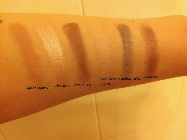
If you ever watch Storage wars, you’ll know what I mean when I say that the middle row of this palette is “packed, stacked and all that, folks”. Because it really is. We have some beautiful neutrals like the Salted caramel, which looks brown-ish in the palette but delivers a nice pink undertone, Semi-sweet which is another great crease color for a bolder look and the Strawberry Bon Bon.
Next to them, we have two matte colors – the Milk chocolate (which is my absolute favorite for the crease color) and the Tripple fudge. I must say that the latter is a bit disappointing in terms of pigmentation – I was hoping for a really strong, bold black which would be useful for the cat-eye look, but it somewhat falls short on that. Still, a nice color for defining the corners or for the under-the-eye lining in the bolder looks.
If you ever watch Storage wars, you’ll know what I mean when I say that the middle row of this palette is “packed, stacked and all that, folks”. Because it really is. We have some beautiful neutrals like the Salted caramel, which looks brown-ish in the palette but delivers a nice pink undertone, Semi-sweet which is another great crease color for a bolder look and the Strawberry Bon Bon.
Now let’s talk about this swatches for a moment. For every other swatch, I only pulled my finger along the shadow once, applied it to my hand and voila. But with Strawberry Bon Bon, I had to pull 5 or 6 times to even get a semi-decent swatch for you guys. So this color really does lack in pigmentation and isn’t really something you could get much use for. Again, it could probably be used as a overall color to create a base for all the rest, but if you’re looking for that pink, doll-like look, you will probably not get there by using this particular shade which is disappointing.
Other three colors in this row are shimmers. I personally absolutely adore Marzipan which has been my go-to color for all over the lid in the everyday make-up routine ever since I got this palette. It’s crazily pigmented but not too bright for work. On the right hand side, we have the Candied violet which is a bit similar to the Gilded Ganache from the first row – I must say that if you’re only using it in the outer corner to create some definition, the difference between both is almost nonexistent. The far right color, the Amaretto, is a beautiful shimmer which translates somewhat orange on my lids. I love this color in the outer corner to lengthen my eyes a little bit.

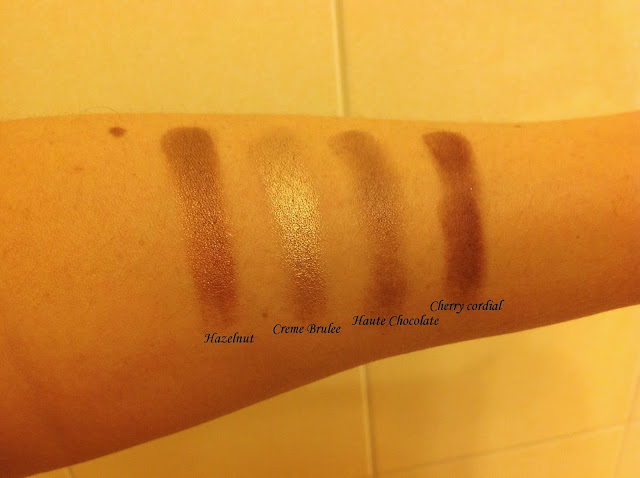
The bottom row is packed with shimmers – light brown (Hazelnut), an absolutely beautiful gold (Creme Brulee), a dark-gold/dark-brown (Haute Chocolate) and a shimmery pink in a cherry color (which is probably why it’s called Cherry cordial). All of these I use extensively – the Cherry cordial to smoke out the look but not get it too harsh, Creme Brulee and Haute Chocolate over the lid and Hazelnut as a crease color. Although I would prefer one or two more matte colors in this palette, I am not in any way complaining about what I have.
The bottom row is packed with shimmers – light brown (Hazelnut), an absolutely beautiful gold (Creme Brulee), a dark-gold/dark-brown (Haute Chocolate) and a shimmery pink in a cherry color (which is probably why it’s called Cherry cordial). All of these I use extensively – the Cherry cordial to smoke out the look but not get it too harsh, Creme Brulee and Haute Chocolate over the lid and Hazelnut as a crease color. Although I would prefer one or two more matte colors in this palette, I am not in any way complaining about what I have.
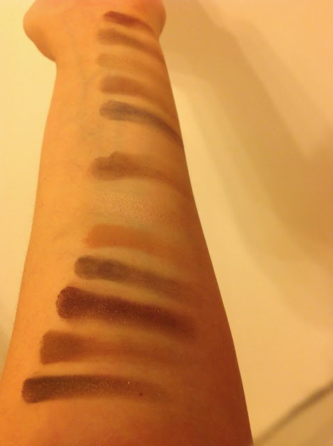
So to summarize – am I glad I got this palette? Hell, YES! The colors are all very warm nudes and that’s what my day to day look asks for at the moment. On the other hand, I can also pack on the shadows to create a smoky night-time look if I wish to. All the colors besides the Strawberry Bon Bon are super pigmented and don’t have any fallout.
What I also find important about this palette is the way that the colors blend out – I am still a bit rough around the edges when it comes to that and with some of the less quality products I can tell that my skills are not quite there yet – I can definitely see some edges when I look up close. But with this palette I don’t have to worry about that at all – the blending is easy, quick and painless.

Verdict? Go get it! You can order it online from Asos.com (it will cost you €64 but I promise you you it will be worth every penny; and no, I’m not getting paid by Asos, in case you are wondering).
When I run out of this palette (which I’m guessing won’t be for a very long time, since I’ve been using it for a month now every day and sometimes more than once a day and it barely shows at all), I will definitely repurchase it. So yes, my first all-time favorite.
Thanks for reading my first thorough review. What’s the one palette you couldn’t live without? Let me know in the comments below!
Until next time, stay beautiful.
What I also find important about this palette is the way that the colors blend out – I am still a bit rough around the edges when it comes to that and with some of the less quality products I can tell that my skills are not quite there yet – I can definitely see some edges when I look up close. But with this palette I don’t have to worry about that at all – the blending is easy, quick and painless.
Verdict? Go get it! You can order it online from Asos.com (it will cost you €64 but I promise you you it will be worth every penny; and no, I’m not getting paid by Asos, in case you are wondering).
When I run out of this palette (which I’m guessing won’t be for a very long time, since I’ve been using it for a month now every day and sometimes more than once a day and it barely shows at all), I will definitely repurchase it. So yes, my first all-time favorite.
Thanks for reading my first thorough review. What’s the one palette you couldn’t live without? Let me know in the comments below!
Until next time, stay beautiful.
